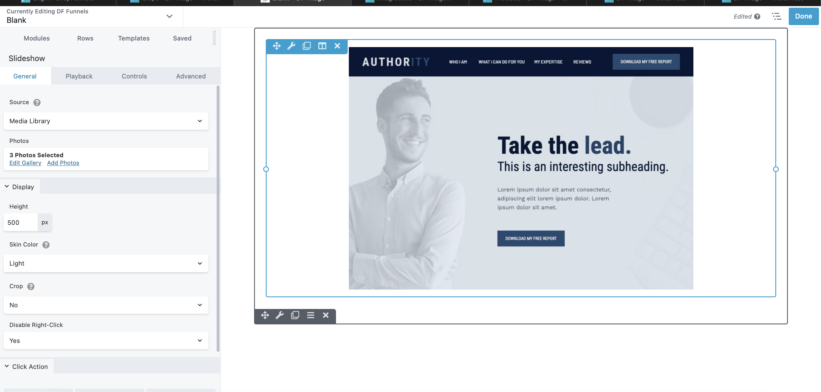
Slideshow Module
Opt for the slideshow module to showcase a series of images one at a time in the foreground. Explore various transition options, aside from the standard horizontal slide, detailed in the Playback tab section below. Pull images from a gallery created in the DropFunnels Media or Uploading a new one from the module itself. While you can display the image title, if your focus is on other content and the image takes a back seat, check out the related modules below.

Slideshow module settings
General tab
This tab has the following settings.
- Source
DropFunnels Media Library - Photos (Media Library only)
Contains links to create a gallery of images in your Media Library or to edit an existing gallery.
Display section
- Height
Sets the height of the box in which images and controls are displayed. The default height is 500px. - Skin color
There's not much difference, but choose Light if you have light-colored images and background and Dark if you have dark-colored images and backgroiund. Individual image size is adjusted to maintain this height. - Crop
Since the Height setting keeps the height of each image constant, the Crop setting determines whether the width of the image will adjust to display the full image (so width will vary depending on each image) or the image width expands to the full width of the column (minus margin and padding) and crops the left and right edges if necessary. - Disable right-click
Does not allow image to be downloaded.
Click Action section
- Type
None, or choose Link to add a URL that will serve as a single destination for the entire set of images. You can't set a separate link for each image. - Link URL
If you selected Link for the Click action, enter the destination URL here.
Playback tab
- Auto Play
Yes (the default) means the images transition automatically and can be overridden by any navigation controls that are displayed. No means the user must advance the images using the navigation controls. - Speed
Number of seconds the full image is displayed. The default is 3 seconds. - Transition
Choose among the following types of transitions from one image to the next. The default transition is Fade.
Controls tab
This tab lets you select which controls you want to display.
The following figure shows the control icons in the control bar that you can see in the DropFunnels editor, with the icon labels underneath the figure. Any of the icons can be displayed or hidden.

Advanced tab
There are all the usual Advanced tab settings for margins, visibility, animations, and advanced HTML settings.

