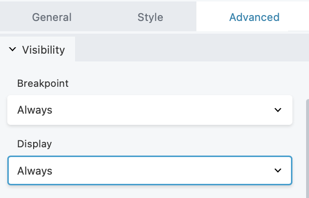
Visibility Inside The DropFunnels Editor
The Visibility section in the Advanced tab lets you determine when your rows, columns or modules display in your layout using breakpoints and conditional logic.
(Note: The Reverse Stacking Order option is only available for Columns.)

Breakpoint
As a default, every row, column, and module is visible on all device sizes. However, you can utilize the Breakpoint setting to hide specific rows, columns, and modules for particular device sizes. In the Global Settings, you can both view the predefined breakpoints and establish custom values as needed.
Device Toggle Icons
Using the device toggle icons, you can quickly select which devices display or hide a row, column, or module. Simply click the device icon to toggle whether the element is displayed (blue) or hidden (gray) for those devices.
You can choose one of the following device toggle icons:
Extra Large Device
The element will be visible or hidden for desktop computers or TVs with a browser.Large Device
The element will be visible or hidden for small desktop computers, laptops, and landscape tablets.Medium Device
The element will be visible or hidden for devices like small tablets.Small Device
The element will be visible or hidden for devices like portrait tablets, and smartphones.
Multi-Selection
By default, all device toggle icons are activated (blue), ensuring that the associated row, column, or module is consistently visible. The device toggle feature offers the convenience of multi-selection, allowing users to pick multiple device options simultaneously. This flexibility removes any limitations tied to predefined combinations, such as Large & Medium or Medium & Small. Users can freely craft any combination they prefer.
For instance, it's possible to display a row on Extra Large, Large, and Small devices while concealing it on Medium devices. Likewise, a Heading module can be hidden on Extra Large and Small devices while being visible on Large and Medium devices.

Stacking Order (For Columns Only)
This option only applies to columns, allowing you to reverse the stacking order of columns for medium and small devices. You can choose from the following options:
- Disabled (Default)
- Small
- Medium
- Small & Medium
Display
The "Display" option allows you to control the visibility of your row, column, or module based on specific conditions, including options like "never," "always," "logged out users," "logged in users," and conditional logic (available only in DropFunnels Editor).
- Never
The row, column, or module is only visible to the user editing the page. This is useful if the design isn’t complete and ready for publishing. Using this feature is an excellent way to ensure that your design is exactly how you want it before making it public on your page layout. - Always
The row, column, or module is visible at all times for every user. - Logged Out Users
The row, column or module will only be visible for logged out users/admin. - Logged In Users
The row, column, or module is only visible to users/admin who have logged in to your website.

Display Icon Indicator
When you set limitations on the visibility of a row, column, or module, an eye icon will be displayed in the DropFunnels Editor UI overlay.
If you limit the display of a row, column, or module using the Never, Logged Out Users, or Logged In Users options, a blue Eye icon will be displayed in the DropFunnels Editor UI overlay.


