Row Effects
In DropFunnels, you can add effects to your Rows. Below are the 5 things that you can do in DropFunnels' Row:
- Row shape overlays
- Video backgrounds in rows
- Ideas for using background colors and effects
- Parallax row backgrounds
- Create a Ken Burns effect in a row background
Row shape overlays
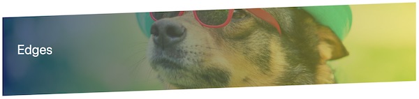
You can add and customize shape layers on rows. By default, rows can be assigned up to two shape layers, which by default are anchored to the top and bottom boundary of rows, so you can start with a top shape or bottom shape, as shown in this screenshot.
Shape settings appear below the Border section on the row's Style tab.
- After you pick a shape (described in the next section), you can make the following customizations:
- Width
- Height
- Y offset (vertical position)
- Alignment within the row (top left, center, etc.)
- Color or gradient fill
- Orientation (flipped horizontally or vertically)
- Skew X (horizontally)
- Skew Y (vertically)
- Scale horizontally
- Rotate on a 360-degree axis
- Clip the shape container to the row boundary
Enable this setting if the shape spreads out beyond the row boundary and you want to contain it.
The effect of these settings is that you can move the top and bottom shapes almost anywhere in the row and skew and modify the shapes.
These transforms are common concepts in graphics applications and UI/UX programming languages. In DropFunnels Builder, they are translated to CSS properties when the page is rendered. See this W3Schools article about CSS 2D transforms and browser support for them.
How to access row edge shapes
- Open a row for editing in DropFunnels Builder.
- On the Style tab, scroll down to the shape sections, following the Border section.
The following sections show examples of each type of shape.
Note: Be sure to test on various devices and in various browsers to make sure your shape settings work for all.
Shape choices
Slanted edge
Tip: To make the shape look clipped, select the same color for the edge as the content background color on your page. If you select a different color from the content background, you'll see a rectangular row or column with the shape overlaid on it. For example, in the Slanted Edge example in the next section, the first screenshot shows an example in which the shape color matches the content background (white), while the second screenshot shows an example in which the entire shape is visible because the shape color is different from the background.
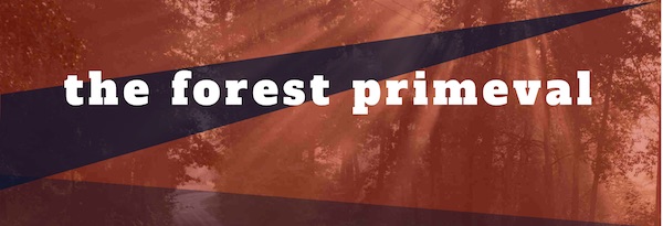
In the following screenshot, the slanted edge is applied to both the top and bottom edges. The background photo also has a background color overlay with a gradient.
Tip: Some users have reported seeing a thin horizontal line at the row border when they use a slanted edge. Adjusting the Y offset setting by 1 pixel should solve the issue.
Here's an example of a slanted top edge used with a rotation and skew, combined with a slanted bottom edge with default settings.
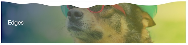
Waves
Here's an example of a white top wave.
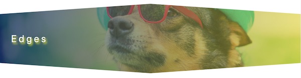
Here's another example of a top wave in a navy color with reduced opacity, skewed and rotated both horizontally and vertically, scaled larger with a negative Y offset, which normally would move the effect upwards, but because of the rotation the negative Y offset moves the effect downwards. If the shape bleeds out of the row boundary, you can choose Clip contents in the Shape container section.

Midpoint
Midpoint has its highest point mid-row and is lower at each row end. This screenshot shows a white midpoint shape applied to both the top and bottom edge with minimal modification from the default settings.
Triangle
The triangle looks like a rotated midpoint, with its low point in the middle of the row. In the following screenshot, the triangle is set to a width of 600px to the cutout effect seems to point to the heading in the center.

Circle
In the following screenshot, the circle is a top shape that is set to Center alignment, so it appears in the vertical and horizontal center of the row. The color is set to 50% opacity.

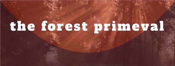
Concave
The concave shape is flat on one edge and has a concave arc at the other end. In the following screenshot, there's a Concave shape at the row bottom with a height of 440px so it stretches up along the sides of the row.
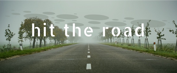
Spots
The Circles shape is a set of larger and smaller elliptical objects. In the following screenshot, the circles in a semi-opaque color were scaled a bit larger, aligned in the center of the row, and then the Y offset value was manipulated to move them slightly higher.
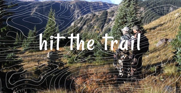
Topography
The topography shape produces concentric circles of the type that appear on topographic maps. Here's an example of a topographic shape with stretched height to cover the entire height of the background image.
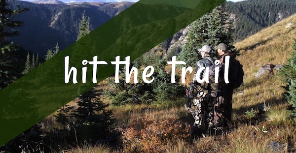
Rectangle
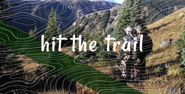
The rectangle shape is a rectangle placed where you want it. In the following screenshot, a rectangle shape at the top of the row was rotated to produce an angled band of color.
Or, here's an example in which a rotated rectangle shape was used at the top and topography used at the bottom.
Video Backgrounds in Rows
Row settings for background videos
To access the row settings for videos:
- Open the row's settings.
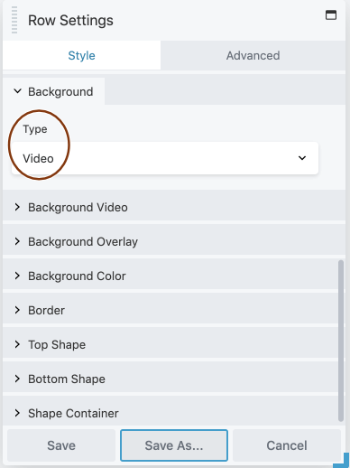
- On the Style tab, scroll to the Background section.
- In the Type field, choose Video.
The following sections are available with settings for video backgrounds, as shown in this screenshot, listed below, and described in the following sections.
- Background video
Specify the source of the video plus other settings related to how and where the video plays. See the section below for more information. - Background overlay
Overlay a semitransparent color on the video. - Background color
Set a background color that displays until the fallback image or the video loaded. Depending on load time, the background color may never appear or may flash momentarily. - Border
Optional standard border settings around the row, including radius and shadow effects. - Top shape, bottom shape, shape container
Add a DropFunnels Builder row shape overlay to the top edge or bottom edge of the row.
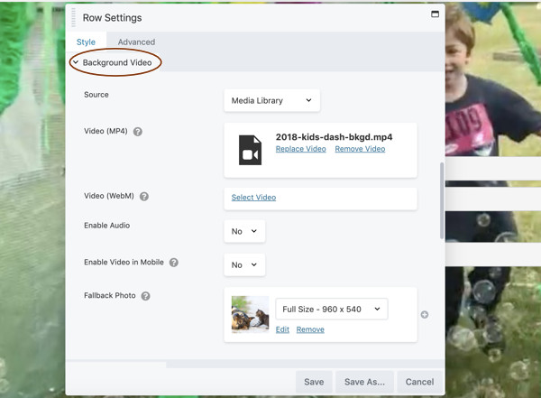
Background video section
In the Source field, specify one of the following sources:
- Media Library
- URL
- Youtube or Vimeo
The following screenshot shows the Background Video settings when the source is the Media Library, In the table that follows, the settings for specifying the video source depending on the selection in the Source field, but the other fields in the Background video section are the same for all video sources.
Background Video section settings for rows
Note: Any of the following URL fields in the Background video section can contain a shortcode for the URL.
| Field | Description |
|---|---|
| Video (MP4) | (Displays when Source is Media Library ) Add an MP4 video that you have uploaded to your media library. |
| Video (WebM) | (Optional, displays when Source is Media Library ) Select a WebM-format video from the media library to display in browsers that can't play MP4 (older versions of Firefox and Safari). |
| Video URL (MP4) | (Displays when Source is URL ) Add the URL to the MP4 video you want to use. Don't use the URL setting for Youtube or Vimeo videos. |
| Video URL (WebM) | (Optional, displays when Source is URL ) Add the URL to a WebM video to use in browsers that can't play MP4 (older versions of Firefox and Safari). |
| Youtube or Vimeo URL | (Displays when Source is Youtube or Vimeo) Add the URL for the Youtube or Vimeo video you want to use. |
| Enable audio | Play the audio track for the video. Note that adding audio requires extra file size and increases load time, and some users do not appreciate it. Use with caution. |
| Enable video in mobile | If set to Yes, the video will play on mobile devices that support it, but the audio track will be disabled. If set to No, the fallback photo displays. If there's no fallback photo, the row background color displays. Note: Use of a mobile device is detected by the browser, it’s not based on a breakpoint, so in Responsive Editing mode in the DropFunnels Builder Editor, you’ll see the video in the Small Device view even when Enable video in mobile is set to No. |
| Fallback photo | (Optional) Displays in any of the following conditions: - While the video is loaded; - When there are technical difficulties loading the video; - On mobile devices when Enable video in mobile setting is No. If Fallback photo is not set, the background color displays under the same conditions. |
Tips for using row background videos effectively
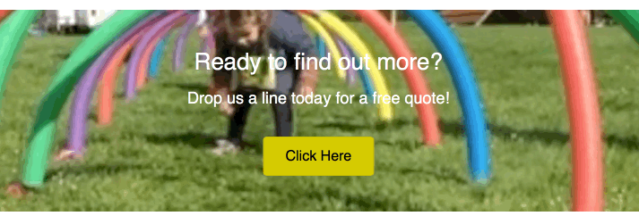
From a design standpoint, a video background can add interest to a page – or it can detract from your content. For example, here's an example of ineffective use of a video background. Not only does the animation grab attention away from the call to action, but the video colors are so bright that the text is obscured.
Here are some tips for using video backgrounds more effectively:
- Edit the video clips to make the file size as small as possible. Try exporting to 720p at 24 frames per second and a low bit rate.
- If you're not playing the audio portion of the video (and in most cases that's a good idea), use a video editor to strip the audio track to reduce file size.
- Keep the video as short as possible and loop it, which also reduces file size.
- Use video clips that are related to the content, but don't use video backgrounds when you want attention on the content, such as the call to action in the previous example.
- Set a semitransparent color overlay in the row settings if it make the row's content more legible. The most common settings are black (#000000) or white (#ffffff) with 50% opacity.
- Not all mobile devices play video backgrounds, so provide a fallback image in the row settings.
- Set a background color, which will display when the video (and optional fallback image) are slow to load, so visitors can start reading the content before the video starts. Use a dark color for light text and a light color for dark text.
- Use a caching mechanism that lazy loads videos, which means the video isn't loaded until the visitor scrolls to that part of the page. This helps to improve your page load speed.
- If you want a higher-resolution video or a longer video or an audio track, use a Video module instead of a video background.
Ideas For Using Background Colors And Effects
Note: All of these colors and effects except shape overlays are also available for column backgrounds. Background color and border effects are available in specific modules, such as the Call to Action module.
Solid color
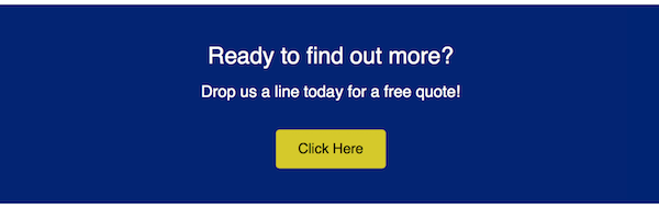
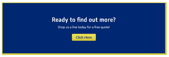
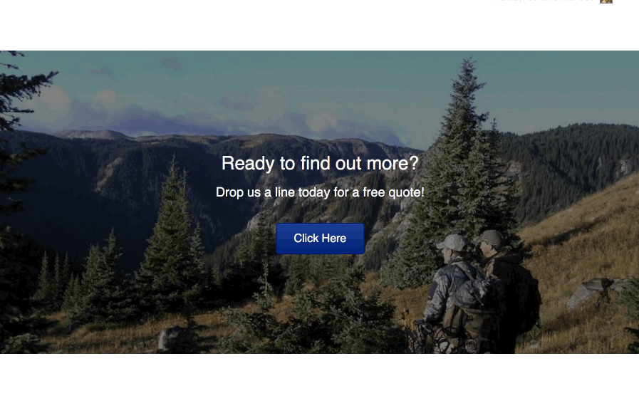
The most basic row or column background is a solid color. Here's an example of a dark blue row background behind a Call to Action module.
Here are a few ideas for variations of the solid-color row background.
Change the opacity
If you're working with a defined color palette, try changing one of the row or column backgrounds in your palette to a slightly lighter opacity. In the following screenshot, the blue color from the previous screenshot is set to 80% opacity for a subtle difference.

If your row has an image background, you can add a color overlay to the row so the color gets dark or lighter and makes text easier to see, as in the following screenshot.
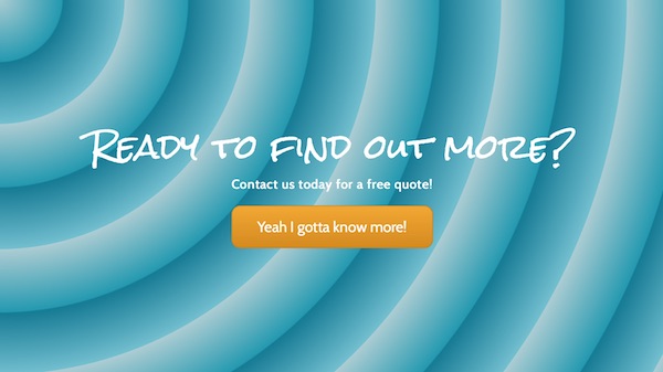
Add a gradient
You can use color gradients in row backgrounds. Here's an example of the Call to Action module surrounded by a radial gradient.

You can also generate sophisticated gradients at third-party sites and add them with CSS. Here's an example of a gradient with a pattern:
Add a row shape overlay
You can add a shape to a row edge that is anchored in relation to the top or bottom border of the row. You can style and transform the shape in various was, such as flipping horizontally and vertically and changing the Y offset, so you can place the shape overlay just about anywhere in the row and give it some interesting effects.
Here's an example of a concave overlay at the top border with a semi- transparent background color and radial gradient overlay that creates something of a halo effect. The background image is fixed, so the overlay allows the trees to peek through in the halo area as the page is scrolled.
Add a border and/or border effects
You can add a border and round the border corners or add a border shadow to any row, column, or module that has a Borders section.
Here's an example where the border is made a bit more interesting by using 5px on the left and top side and 10px on the right and bottom side.
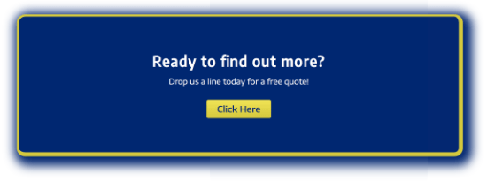
In the following screenshot, a radius and shadow have been added in the same blue color as the row background.
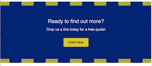
Or you can make a border style become part of the design. In the following example, there's a 20 px upper and lower border of the same color as the button, set to Dashed and 80% opacity. To compensate for the large border, the row padding is increased to 40px. Notice how the bold effect draws the eyes toward the call to action.
Add texture
Row backgrounds with both color and texture become even more interesting. The best way to add texture is to use an image for the row background. Choose Photo instead of Color in the row settings.
Here's an example of an image with color and texture used as a background. This example has no border, but radius and shadow border effects were also applied to soften the corners.
Set off content with a background in a column or module
No matter what type of row background you have, you can add a color background to a column (or sometimes a module). In the following screenshot, a semi-opaque background color was added to the Call to Action module.
If another background like an image completely hides the background color, the color may still be visible briefly while the image is loading.
Color overlays
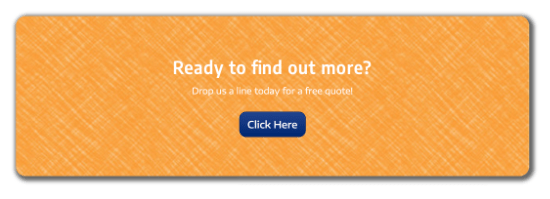
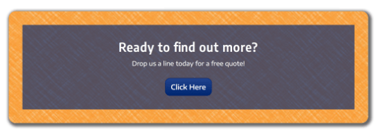
If you're using an image or video as a row background, you can improve the legibility of text by using a background overlay color. For example, the following screenshot shows the difference in the legibility of the text without a row background overlay and with a row background overlay set to black (#000000) at 50% opacity.
As an alternative, you can set a background color on the column. In the following screenshot, the column has a background color set to #333333 at 50% opacity. You can vary the exterior and interior size of the column with margin and padding settings.
Parallax Row Backgrounds
Parallax refers to when both the background image and the foreground content scroll, but at different speeds.
The parallax effect is very striking, but don't overuse it! You don't want your visitors to be so mesmerized by the movement on the page that they don't pay attention to the content.
To create a parallax row background:
- Open the row settings.
- On the Style tab, scroll to the Background section and in the Type field choose Parallax.
The Background parallax section opens with more options. - Choose the photo to use for the row background.
- Choose the speed at which you want the background image to scroll.
Other options:
- If you want the image to have more height while it scrolls, change the row's Height setting near the top of the Style tab to Full height or set a minimum height, or on the Advanced tab increase the top and bottom row padding.
- Choose a row background color in addition to the background image to display that color in cases where the image doesn't load instantly. This provides a splash of color, but more importantly, it can improve legibility of the content before the image loads. Use a dark color for light text and a light color for dark text.
- Use a color overlay on the image to improve legibility of the text while the text and image are scrolling. A typical overlay would be the color black (
#000000) or white (#ffffff) at 50% opacity, but it can be any combination of color and opacity. - Set a row border to demarcate the edges of the image as it scrolls.
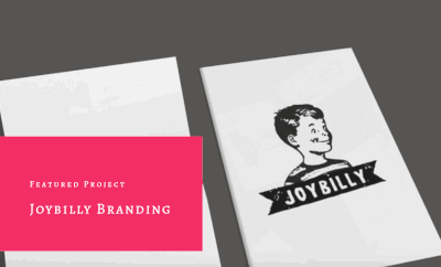
Create a Ken Burns Effect in a Row Background
If you're not familiar with a Ken Burns effect, you can see what it looks like by adding the Agency landing page template to a layout and scrolling down to the "Joybilly Branding" section. Here's a preview:
The Ken Burns effect starts with implementing a slideshow as a row background with a minimum of two images. Here's how.
To create a Ken Burns effect:
- Open the row for editing in the DropFunnels Builder editor.
- In the Background section, for Type choose Slideshow.
- In the Photos field, click Add photos and create a gallery with at least two images.
- Set Speed to the number of seconds you want each image to display.
- For Transition, select Ken Burns.
- Set Transition speed to the number of seconds that each photo transitions to the next.
- If you want the photos to display randomly instead of in the gallery order, set Randomize photos to Yes.