Responsive Editor
The Responsive Editing mode allows you to create and edit your layouts in a way that ensures they look great on all devices.

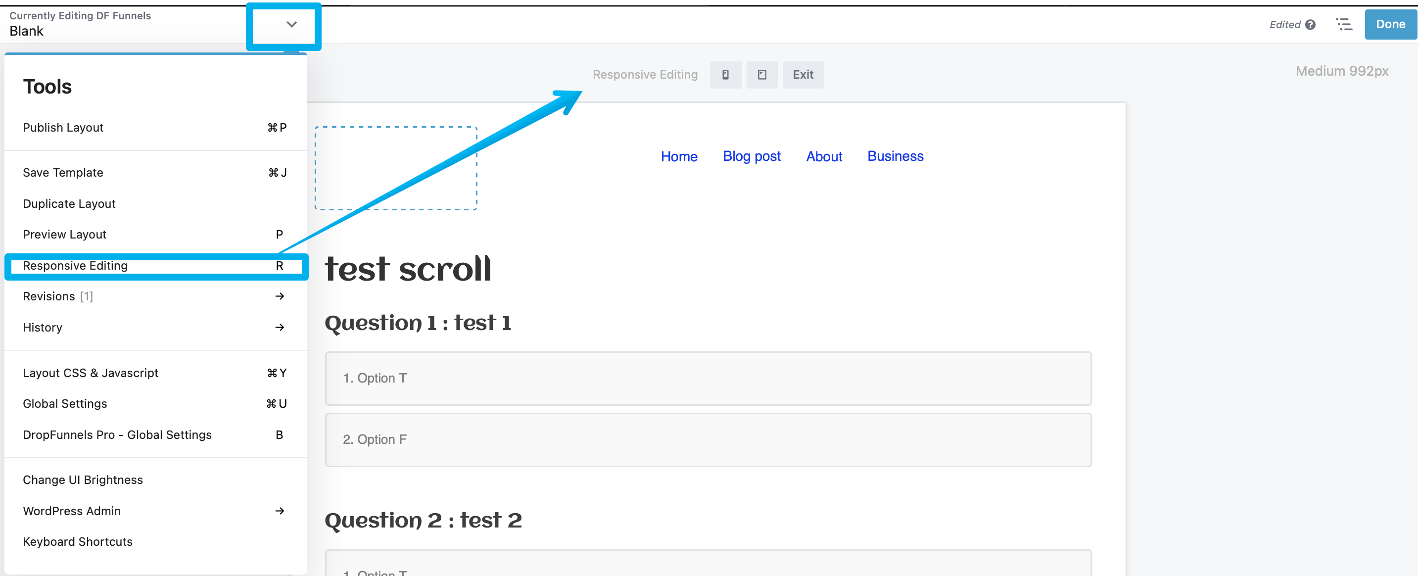
Access Responsive Editing mode
Enter Responsive Editing mode in any of the following ways:
Step 1: Click the Responsive Toggle icon next to settings that have it for a row, column, or module.
Step 2: Your page view will stay in responsive editing mode even if you close the Settings window. Use the Exit button to close responsive editing.
Step 3: On the Tools menu, click Responsive editing.
Keyboard shortcut R
This keyboard shortcut toggles responsive editing mode.
Breakpoint
The Breakpoint drop-down menu allows you to toggle between devices (Large, Medium, and Small) and the responsive editor will automatically adjust to the size of that device.
By using the device buttons, the current device will be active on the Responsive Toggle when accessing the row, column, or module settings. As a result of this, you can preview your layout and tweak your original design to make it suitable for all device sizes (large, medium, and small).
See the Breakpoints article for more information.
Width & Height
The Width and Height options allow you to adjust the dimensions of the layout preview to custom values.
Zoom
Use the Zoom options to zoom in or out. You can choose between 100%, 75%, 50%, and Fit to Window.
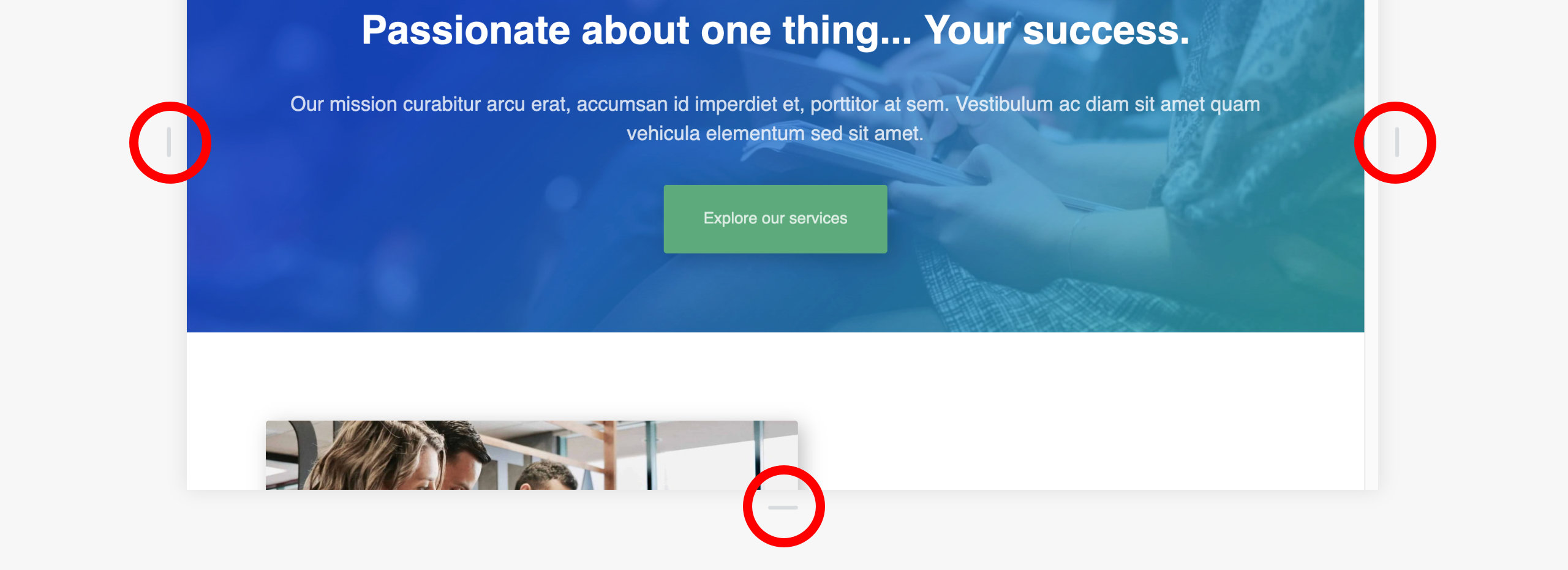
Drag Handles
Using the Drag Handles is another way to adjust the width and height of the layout preview. To do so, click and hold on the handle, and drag either left or right to adjust the width, or up or down to adjust the height as needed.

Device Previews
The Responsive Editor provides an accurate preview of the layout you're editing for a variety of devices. You can preview the layout at any size you choose using the Width and Height options or the Drag Handles.
Per-device Styling
The Responsive Editor does not create separate layouts for each device size. You can, however, adjust your layouts per-device using the Visibility options and Responsive Toggle.
The Visibility options utilize DropFunnels Builder breakpoints and allow you to show or hide row, column, or modules for specific devices.
The Responsive Toggle allows you to configure specific settings, such as font size, background image or column width on a per-device basis.
Note: It is not possible to change the position of a row, column, or module for a specific device size, since the position change will be applied to all devices.
The same is true when removing content from your layout. For example, removing a row, column, or module for the medium device size will also remove the content for all other device sizes (Extra Large, Large, and Small). See this guide on How to make Pages, Funnels, and Courses Mobile/Tablet Responsive

