Off-Canvas
The Off-Canvas module allows you to design a stunning off-canvas panel that can slide in over your page. The off-canvas panel can be triggered with a button, text, image, icon, or through any other module. This panel can display Content, Menu, Saved Rows, Saved Modules, and Saved Page Templates.
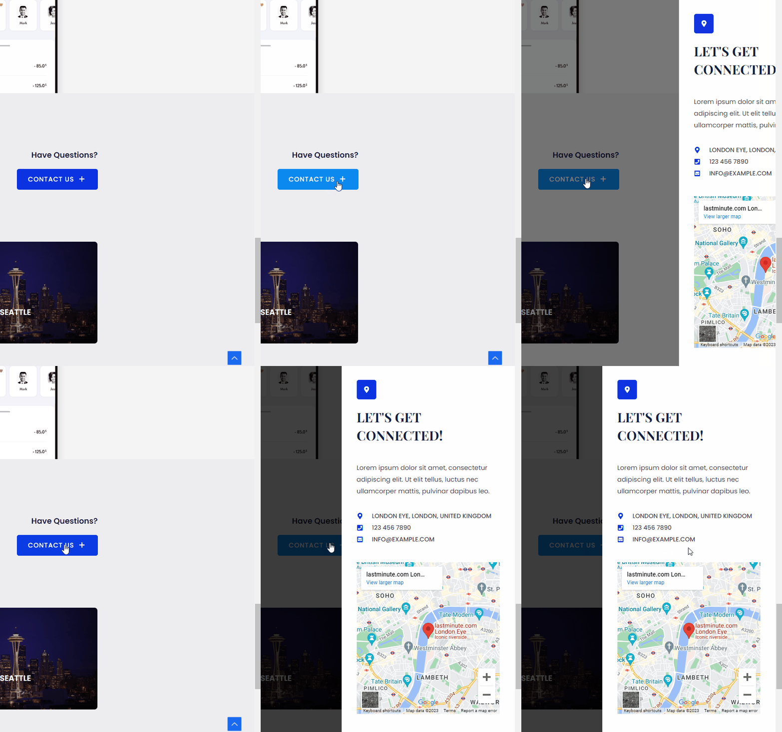
Key features:
- The off-canvas panel can display – Content, Menu, Saved Rows, Saved Modules, Saved Page Templates.
- Trigger off-canvas content with – Icon / Image / Text / Button / Custom Class / Custom ID
- Off-Canvas window width and position option (Left/Right)
- Off-Canvas window appear effect (Slide/Push)
- Preview off-canvas window in the backend
- Close Button style having options like Icon, Alignment, Size, Color
- Off-Canvas window background color and content spacing
Below are the settings available for the Off-canvas Module
Content
Under the Content section, you will see two options –
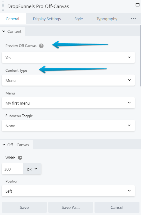
- Preview Off Canvas: Enabling this option will give you a preview of the Off-Canvas so that you can see how it will appear in real-time.
- Content Type: Choose what type of content you wish to display in the off-canvas window. available options are – Content (text, HTML) / Menu / Saved Rows / Saved Module / Saved Page Templates
OFF-CANVAS
Under Off-Canvas section, you will see four options –
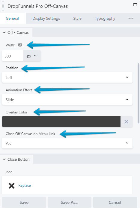
- Width: This allows you to control the width of the canvas. You can specify the width in px and responsive devices with toggle.
- Position ( left/right ): Choose a direction off-canvas content should appear
- Appear Effect: Choose entry effect for the off-canvas window.
- Overlay Color: This will be applied to the rest of the window than off-canvas. It will help to highlight the off-canvas window.
- Close Off-Canvas on Menu Link: This setting on being enabled will close the Menu on Menu item click.
Canvas background color and padding can be managed from Style tab > Off Canvas
Close Button
Under the Close Button section in the General Tab, you will find multiple options –
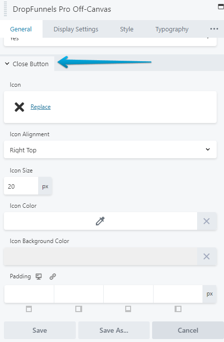
You can customize the button that will close your canvas. You can set the Close Icon, select its Size, Icon Color, Icon Background Color, position and related style of the close button.
Options to close popup on ESC Keypress and on Overlay Click are available.
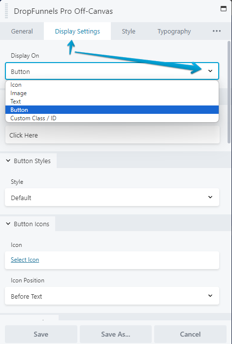
Display Settings
Display settings will allow you to choose a trigger for canvas. You can display it on the click of a text, icon, button or any other element (with CSS class/ID).
