How to make Pages, Funnels, and Courses Mobile/Tablet Responsive
Learn how to edit your pages, funnels, and courses for mobile and tablet devices. Create different size elements on your page depending on the screen size of your visitors. This will allow you to optimize your pages for all devices types.
There are three things you need to remember or consider before using the mobile responsiveness function;
1. There are tons of different browsers, these browsers all speak different languages. You simply need to provide the best option for all these devices to display your content in the best way possible.
2. It is important to know that this is an emulator. So everything you see within Dropfunnels editing mode is the best description of what you will be seeing visually. Even if you do not do any mobile responsive editing, it’s gonna do its best to make everything fit on any device. If you have a lot of videos, images on your page's content and you do not want to show all of them on small devices like mobile phones, you can hide some of them if not all.
3. It is very critical to test your page to an actual device to give you an actual experience of how your page would look on a mobile phone.
The general rule of thumb is; the simpler your pages are, the simpler it will be for it to be mobile responsive and looks good on any device.
Steps in doing mobile responsiveness editing
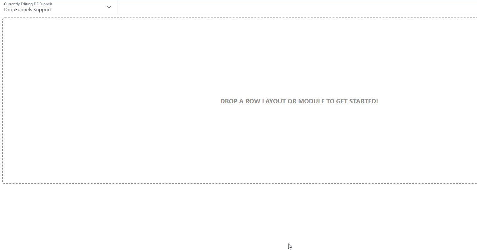
Step 1: Press the letter "R" on your keyboard, this has to be done while you are in edit mode or while editing the page or funnel alternatively you can also click the Dropdown menu at the top left corner to show the tools menu and select "Responsive Editing".
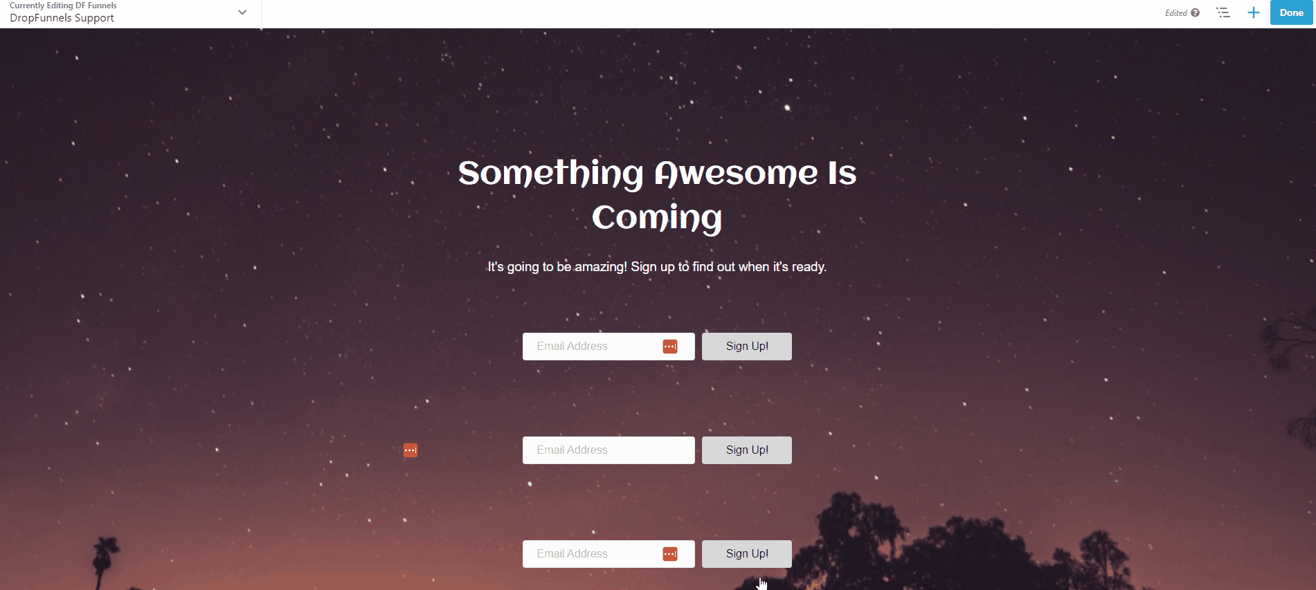
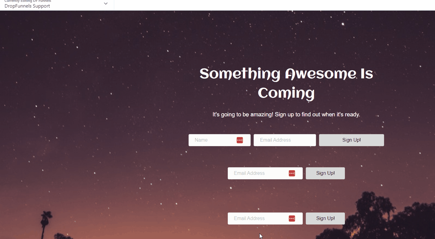
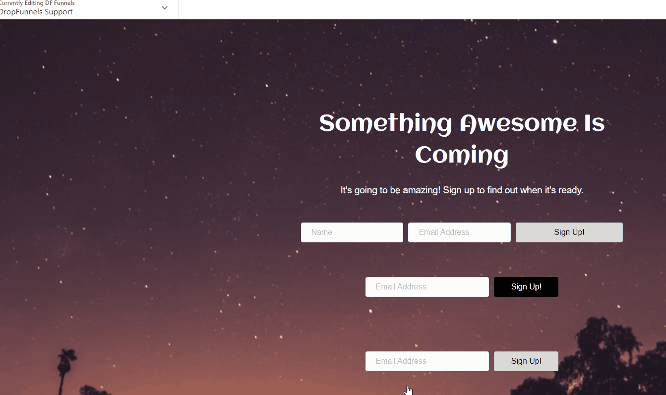
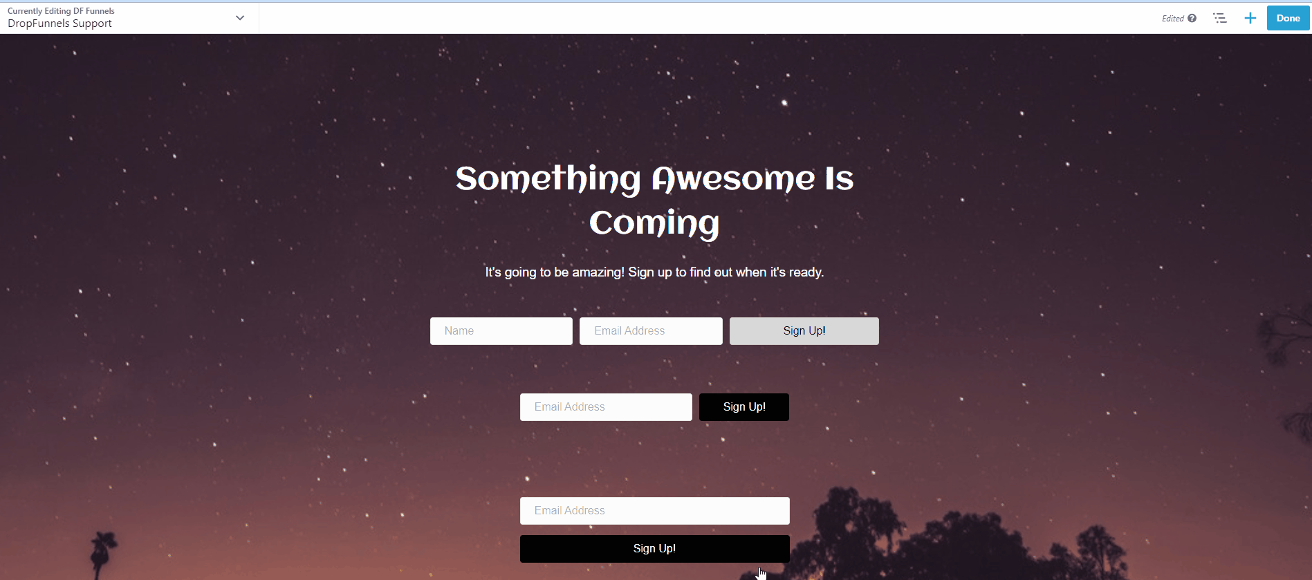
Step 2: Create a version for Small, Medium, and Large Devices.
If there is content that you would prefer not to show on small devices, you can hide those content. Small devices will show the compact version of your page, you have to consider what you would want to show as content. We suggest creating 2 or 3 versions of your content.
Creating a version for Small Devices means that the content will only show on Small/Mobile Devices and a version for Medium and Large Devices will only show on Medium and Larges Devices like Tablets and Desktop. To do this you need to create 2 or 3 copies of either Row, Column, or Module.
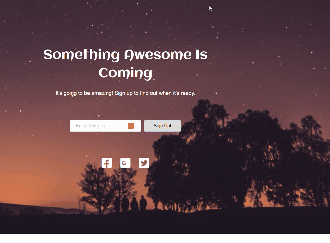
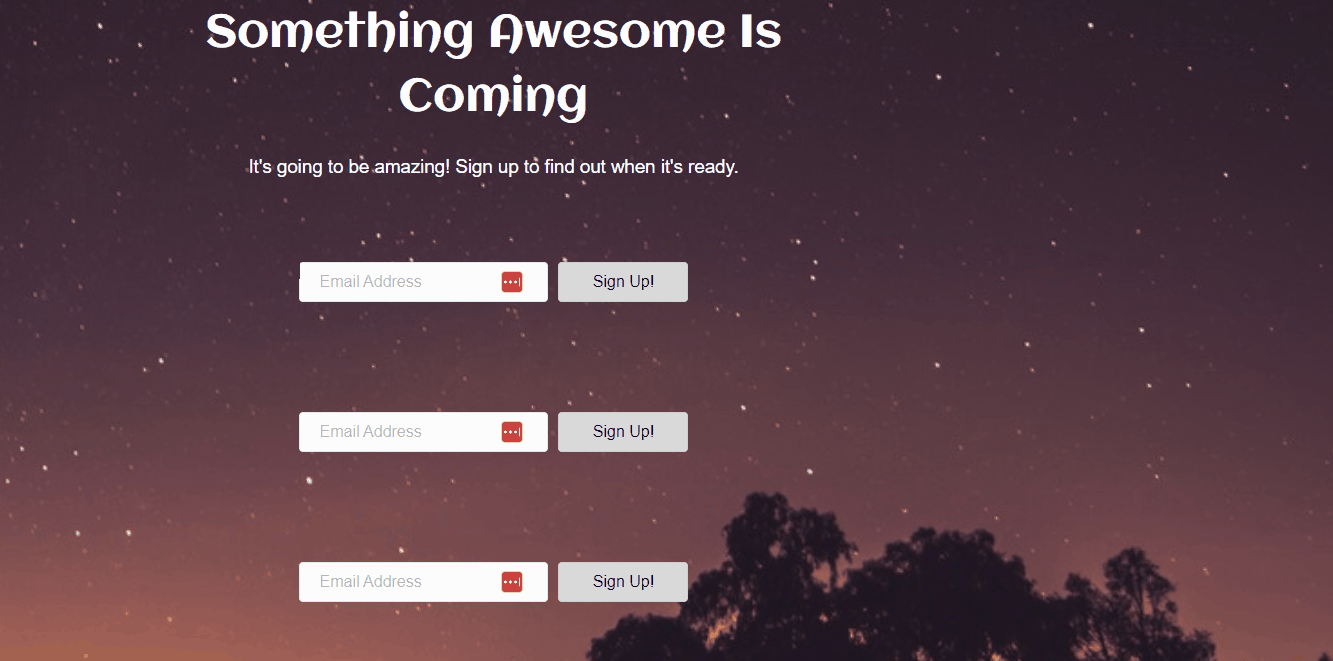
Note: In this example, we will be Subscribe form module and make it responsive.
Step 3: Select the device type that you would like to do the responsiveness editing, you can select between Small devices (mobile devices) and Medium devices (tablets).
Note: The top right of the responsive editing shows if you are on a Small view or Medium view and it also shows the size of the screen in pixels.
Step 4: Edit the Row/Column/Module and design it based on the look and feel that you'd like.
Note: Make sure to only make changes on the Row/Column/Module if you are on the right editing view and Breakpoint. For example, if you set a breakpoint on subscribe form module to only show for small devices make sure that you are editing that module on the Responsive editing view for Small Devices.
Designing Large Device breakpoint
Check the breakpoint of Row/Column/Module and make sure that it is set to Large Device only, if not you need to set it to Large Device by going to Settings> Advanced> Visibility> Breakpoint> Large Devices Only. Then start designing the content.
Designing Medium Device breakpoint
Check the breakpoint of Row/Column/Module and make sure that it is set to Medium Device only, if not you need to set it to Medium Device by going to Settings> Advanced> Visibility> Breakpoint> Medium Devices Only. Then start designing the content.
Designing Small Device breakpoint
Check the breakpoint of Row/Column/Module and make sure that it is set to Small Device only, if not you need to set it to Small Device by going to Settings> Advanced> Visibility> Breakpoint> Small Devices Only. Then start designing the content.
Note: You can quickly see if a breakpoint is set by hovering your cursor at the Row/Column/Module and you should see a "blue eye" Icon.
Step 5: Preview Layout
If you are satisfied with your work and you want to see the changes that you made in Large, Medium, and Small devices you can check it on Preview Layout, press the letter "P" on your keyboard, this has to be done while you are in edit mode or while editing the page or funnel alternatively you can also click the Dropdown menu at the top left corner to show the tools menu and select "Preview Layout".
Step 6: Click Done and Publish
If you are happy with the result after editing using mobile responsiveness, you may simply publish your work to save the settings you did for mobile responsiveness. Lastly, you need to check the newly edited page with an actual small device (mobile phone) to see how it would actually look.
Global Settings > Responsive Layout

Enable Responsive Layout
Turning off Responsive Layout means there will be no Breakpoint even if you set a breakpoint in any Row/Column/Module. This will simply ignore all the breakpoints that you have set and will only use the Large Devices Design. So make sure to always turn it on.
Enable Auto Spacing
When auto spacing is enabled, the builder will automatically adjust the margin and padding in your layout once the small device breakpoint is reached. We recommend turning this on but if you want to manually set margin and padding to all your layout you can turn this off.
Small and Medium Device Breakpoint
This is where can set the width of Small and Medium devices in pixels. When you enter responsive editing these values also show at the right side of the builder.
Use responsive settings in previews?
Preview Layout and Responsive Editing will use the values that you set on Small and Medium Device Breakpoint. If you turn this off changes that you made may not reflect on Preview Layout and Responsive Editing but will only reflect on live preview.
Base Font Size
This value will be the default value in any of your Font until you change it.
Note: All changes to Global Settings will be reflected on all your Funnels or Page. If don't know what to do please contact us first by submitting a ticket.